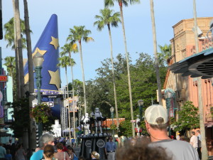
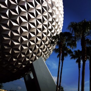
 Every park at Walt Disney World has a major icon. Known affectionately as a “weenie” – a term coined by Walt Disney himself – the icon’s purpose is to draw guests forward. Cinderella Castle in Magic Kingdom is breathtaking! Situated as it is on the hub at the far end of Main Street U.S.A., when you enter the park, you’re drawn immediately by the castle’s splendor. That’s exactly how a well-designed weenie is supposed to work. Spaceship Earth in Epcot? Yep, it’s the real deal. The Tree of Life over at Animal Kingdom? Without a doubt! The Sorcerer’s Hat in Disney’s Hollywood Studios? Well, no! A pretty epic failure as a weenie on all fronts. Plus, it didn’t even arrive until the park had been open more than ten years. Poor Studios! Weenie-less virtually since day one and nope, the Chinese Theater wasn’t a good weenie either. More on that later.
Right now, as the Sorcerer’s Hat is about to be removed (good riddance, I say!), let’s talk about WHY the hat was a horrible failure as a Disney park icon. As usual, here are FIVE good reasons to rejoice as we say, “So Long, Sorcerer’s Hat”! (Feel free to voice your comments and opposing opinions – you know I love a good debate!)
 Five ways the Sorcerer’s Hat Failed as a park icon:
1. Thematically Askew – The park’s original design embraced the Golden Age of Hollywood. The streets, buildings, props, and decorations all reflected that theme. Along comes the hat. Plopped down smack dab in front of the Chinese Theater, nothing about its form or fashion embraced the Studio’s personality.
2. Too Short – For a weenie, the hat is just the wrong shape and size. At 122 feet tall, it’s dwarfed by the other parks’ icons. Cinderella Castle: 189′ tall. Spaceship Earth: 180′. The Tree of Life: 145′. Even compared to other Studio’s icons, the hat’s shrimpy. The Tower of Terror is 199′ tall and the Earful Tower is 130′ high. No other icon is pointy-topped, either – they’re all more attractively proportioned.
3. Not Generic Enough – The hat is too specific to ONE character and ONE movie. For me, that makes it a very poor choice as a park icon. Yes, the argument can be made that Cinderella’s 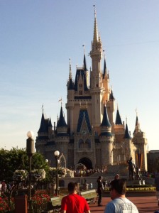 Castle is named for a particular movie and character, but the graceful beauty of the structure itself is a basic representation of EVERY fairytale castle. The hat? Not so much.
4. Undignified – You can’t argue that it has a very cartoonish appearance. The while-gloved, oddly attached hand makes it all the more ridiculous. Neither graceful nor majestic, the hat’s clownishness may be cute, but does not have the right stuff to represent Disney’s Hollywood Studios properly now and certainly not into the park’s much anticipated future. It hasn’t aged well, either. Similar in style (and added during the same era) to the hand and wand that marred the perfection of Spaceship Earth, the hat has overstayed its welcome.
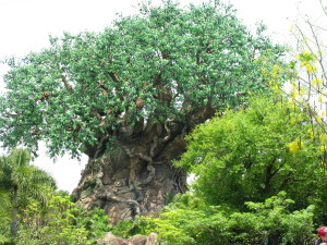 5. Not Timeless – Isn’t that what a perfect park icon should be? From inception, a park’s main icon should represent the park’s theme and purpose while remaining classically “Disney” for all time. Will the Tree of Life grow old? NO. It was created to remain a timeless embodiment of Animal Kingdom’s very soul. With 300+ highly detailed animal carvings and more than 100,000 man-made leaves – the tree will be amazing 100 years from now.
Back to the Chinese Theater. The idea of creating an exact replica of the original Hollywood icon made the Chinese Theater was a poor choice as a weenie from the very beginning. One  problem is that it had already gone from Grauman’s Chinese Theater (opened in 1927) to Mann’s Chinese Theater (in 1973). Now it’s TCL Chinese Theater (2013) – who knows how long it will last or by what name and ownership it may be known in the future. A better choice would have been a generic timeless representation of Hollywood’s Golden Age.
I can think of several possible replacements for the Sorcerer’s Hat. If the future of Disney’s Hollywood Studios indeed brings changes and additions that would prompt yet another new name for the park (rumored to become Disney’s Hollywood Adventure), I believe an icon representative of Hollywood would be in order. How about something that reflects both stage and screen? Literally – a stage topped by a giant, multi-sided screen would be an awesome icon. Think about it – both the stage and the “frame” for the screen could be fancy and a charmingly old-fashioned tribute to Hollywood glamor, but the screens (3 or 4-sided for optimum viewing) would be the perfect opportunity for Disney World to show off its high-tech capabilities. Like the jumbo-tron-type screens on the decks of Disney’s cruise ships, an enormous stage and screen display in the Studios would offer unlimited entertainment and promotional opportunities!
What would YOU replace the Sorcerer’s Hat with? A giant movie camera/film reel statue? Enormous popcorn box, perhaps? Are you sad to see the hat go? What are your thoughts on the matter?
